


When markets are running hot and everyone around you seems to be making money, it is easy to stop asking whether prices actually make sense. History shows that is exactly when the question matters most. Investors have developed several tools to measure whether the overall market is cheap, fairly valued, or stretched beyond what the underlying economy can justify. The most famous of these is a ratio so simple it fits in a sentence, yet it has flagged every major bubble of the past half century. Understanding it gives you a framework for thinking about market risk that most retail investors never bother to build.
What the Buffett Indicator Actually Measures
The Buffett Indicator compares the total market capitalization of all publicly traded US companies to the country’s gross domestic product. Warren Buffett called it “probably the best single measure of where valuations stand at any given moment,” which is how the name stuck. The formula is straightforward: divide the Wilshire 5000 total market cap by US nominal GDP, then multiply by 100 to express the result as a percentage.
The logic behind it is equally straightforward. Companies are part of the economy. Over long periods, their combined market value should bear some reasonable relationship to the economic output that generates their revenues. When the ratio is low, the market is pricing in pessimism, often more than circumstances warrant. When the ratio is very high, the market is pricing in optimism that the underlying economy may not be able to support.
The Wilshire 5000 is used as the numerator rather than the S&P 500 because it includes virtually all publicly traded US companies, giving a more complete picture of total market value. US nominal GDP is used in the denominator rather than real GDP because market cap is also a nominal figure and the two need to be comparable.
Historical Readings and What They Predicted
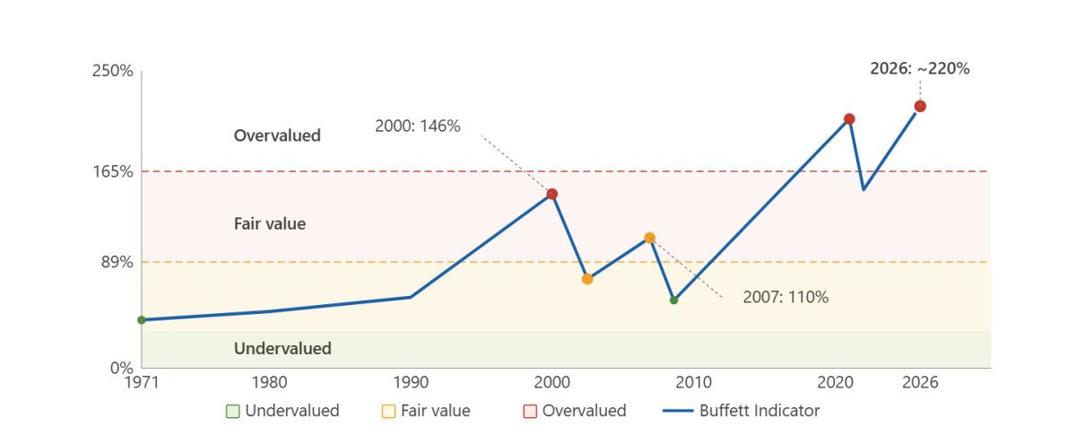
The power of the indicator comes from its track record. Looking at the data across several decades, the pattern is consistent: when the ratio climbs well above the long-term trend, markets tend to deliver poor returns over the following years. When it falls sharply below trend, returns tend to be strong.
The dot-com peak in 2000 pushed the ratio to 146%, a record at the time. Buffett himself wrote in a Fortune article in 2001 that the level “should have been a very strong warning signal.” The S&P 500 subsequently fell roughly 50% from peak to trough. Before the 2008 financial crisis, the ratio reached around 110%, which in historical context was already elevated. The market then dropped by a similar magnitude.
After the 2009 lows, when the ratio fell back to around 57%, equity markets went on to produce one of the longest bull runs on record. The relationship between low readings and subsequent strong returns was consistent.
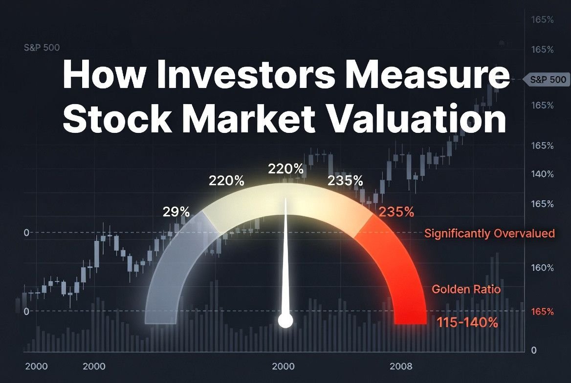
The current reading is in different territory altogether. As of early 2026, various methodologies place the ratio between 202% and 236%, depending on whether the Wilshire 5000 or the Fed’s broader corporate equities measure is used. Every reading in that range represents the highest levels ever recorded, surpassing even the dot-com peak by a wide margin.
The Valuation Zones and What They Suggest
Analysts generally segment the indicator into five zones based on historical context. Below 89% signals significant undervaluation. From 89% to 115% suggests modest undervaluation. From 115% to 140% represents fair value. Between 140% and 165% indicates modest overvaluation. Above 165% flags significant overvaluation.
The current reading sits roughly 55 to 70 percentage points above even the “significantly overvalued” threshold, depending on which data source and methodology you use. On a detrended basis that accounts for the structural upward drift in the ratio over decades, the current reading is approximately two standard deviations above the long-run trend.
The table below shows how the indicator has behaved at key historical turning points:
| Period | Approximate reading | Market outcome |
| 1982 (market bottom) | ~40% | Start of major bull run |
| 2000 (dot-com peak) | ~146% | ~50% market decline over 2 years |
| 2007 (pre-crisis peak) | ~110% | ~55% market decline 2007-2009 |
| 2009 (crisis trough) | ~57% | Start of 12-year bull run |
| 2021 (post-COVID peak) | ~210% | Market declined ~25% in 2022 |
| 2026 (current) | ~220-235% | Historically unprecedented level |
The Limitations Worth Taking Seriously
The indicator has genuine weaknesses that every investor should understand before using it as a decision tool. First, GDP is reported quarterly with a lag. The market cap figure changes daily. Comparing a real-time numerator to a lagging denominator introduces timing distortions that can make the ratio look more extreme than it is in the moment.
Second, the US stock market has become increasingly global in its earnings base. Companies like Apple, Microsoft, and Alphabet generate the majority of their revenues outside the United States. GDP only measures domestic economic activity. As American multinationals have grown and globalized over the past 30 years, a structurally higher ratio may partly reflect this earnings globalization rather than pure overvaluation.
Third, interest rates matter. When rates are near zero, future cash flows are discounted less aggressively, which mechanically supports higher valuations. A ratio of 200% in a zero-rate environment may be less dangerous than the same ratio in an environment of 5% rates, though both are clearly elevated.
These limitations do not invalidate the indicator. They mean it works best as a long-term compass rather than a short-term timing signal. Extremely high readings have historically been followed by periods of below-average returns. They have not reliably predicted when the correction would begin.
Conclusion
The Buffett Indicator is one of the most useful tools available for assessing whether the stock market as a whole is expensive or cheap relative to the economy that underpins it. Its simplicity is a feature rather than a flaw: it cuts through the noise of quarterly earnings surprises and short-term sentiment to ask a single foundational question about whether market prices are aligned with economic reality. The current reading near 220% to 235% puts it well into historically unprecedented territory. That does not mean a crash is imminent. It does mean the margin of safety for equity investors is thin, and that the risk-reward calculus for new long-term positions deserves careful consideration.